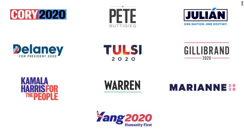
Washington (CNN)If there are any emerging design trends among the initial 2020 campaign logos, it’s the use of words over symbols, and the embrace of color outside of the traditional red, white, and blue. Gone are the patriotic single-letter presidential logos popularized over the past decade.
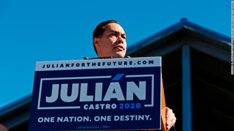
Julián Castro, for example, kicked off his campaign in his home city of San Antonio with a logo that emphasized the accent in his first name, rising like an airline tail mark and literally breaking outside of the box. Sen. Kirsten Gillibrand, whose past Senate campaigns used blues and teals, opted to frame her 2020 logo in pink, a color typically associated in politics with activism, from the gay rights movement to pussyhats. Spiritual author Marrianne Williamson also used pink.
Rep. Tulsi Gabbard, one of two millennial veteran candidates in the race, has a rising sun inside her name log, while the other, South Bend, Indiana Mayor Pete Buttigieg used a logo with a star that recalls John McCain’s 2008 military-inspired logo.
In a crowded race without a definitive early frontrunner, 2020 logos so far seem directed at building name ID, their color schemes optimized to stand out against other campaign signs on the sides of roads in Des Moines or Manchester. They also look like a response to changing political design trends.
Most of today’s presidential branding has more in common with logos from 2018 candidates like Alexandria Ocasio-Cortez, Beto O’Rourke, and Stacey Abrams than Barack Obama or Hillary Clinton. During the midterms, Democratic candidates used a rainbow’s worth of color, and many candidates chose name logos as opposed to letters or symbols. Interestingly, the only two candidates to use single-letter logos were the earliest to announce, former Rep. John Delaney and nonprofit founder Andrew Yang, who use D and Y logos, respectively. Both announced their campaigns in 2017, before the midterms.
“I actually think the lesson from 2016 may not be what makes a good logo, because Trump had no real logo, it was just the word ‘Trump’ with the slogan, ‘Make America Great Again.'” Michael Bierut, a partner at Pentagram, the firm that led the design of Clinton’s H logo, told Cover/Line.
“I think more than anything else, he had come up with a reductive message that people could interpret as their own personal dog whistle if they wanted, about what kind of America they wanted restored and what was insufficient about the current America that needed to be undone,” he said.
Indeed, MAGA hats became a type of logo for Trump’s campaign, and one that’s followed him to the White House.
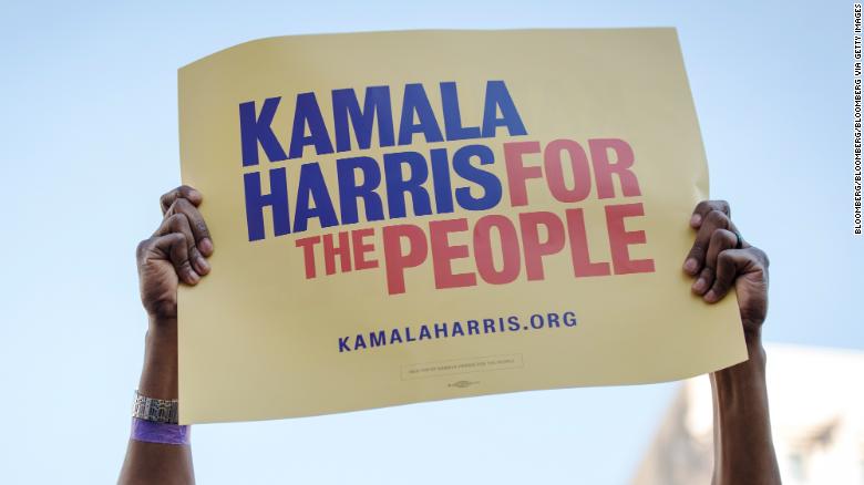
Sen. Kamala Harris included a slogan in her logo. “Kamala Harris For the People” references her time as a prosecutor while doubling as a populist message, with “The People” holding up her name. The logo was designed by the creative agency Wide Eye and inspired by the branding for Shirley Chisholm, the first black woman to run for a major party’s nomination, in 1972.
And Sen. Cory Booker’s website currently features an alternating version of his red, white, blue, and black logo that toggles between “Cory 2020” and “Rise 2020” when users move their cursor over it. It’s written in Conductor, a font co-designed by Tobias Frere-Jones, who also designed Obama’s font Gotham.
They’re a far cry from the logos of the early ’00s, in which a candidate’s name was typically set against dark blue and used along with representations of flags or eagles. George W. Bush’s campaign, though, sometimes broke out the “W” as a stand-alone symbol. It was a way to visually represent the candidate with the fewest letters possible, and it could be used for special branding, like “W Stands for Women” campaign signs.
In 2008, Chicago designer Sol Sender and his team took that idea further and developed a sophisticated single-letter logo for Obama. It managed to work in the political design trope of an American flag with its red and white stripes, but reimagined it into something new. It was a corporate-style logo, politics’ own Nike swoosh.
The O logo’s impact could be seen four years later, when Mitt Romney ditched his 2008 full-name-with-eagle logo for a red, white, and blue letter R. By 2016, candidates like Rick Perry, Bobby Jindal, and Clinton used single-letter logos.
To Sender, early 2020 design exhibits timidity. “I have no doubt they are courageous people, but I don’t think they’re putting the boldest look forward in terms of their graphic identity or their brands,” he said. He wondered if it was intentional, noting how many examples he saw of opponents using the O logo to criticize Obama.
“I think it’s risky to put yourself out there, and obviously, Trump is going to ridicule every single one of them,” Sender said. “He’s going to use everything he can to ridicule them and brands and graphic identities can be ridiculed.”
Case in point, Sen. Elizabeth Warren. Opponents tried to define her with an imagined parody campaign logo of Warren identity, created by the Daily Wire and tweeted out by Trump on January 3. Using the wavy red and blue lines of Bernie Sanders’ 2016 logo, it replaced “Bernie” with “Warren” and added a fraction underneath — 1/2020th — to mock Warren’s DNA test results. It was Trump’s “Pocahontas” slur, in fake logo form.
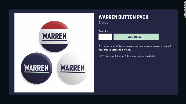
Warren’s actual logo is her last name in all-caps and underlined set in suffragette colors of purple, white and green (“Liberty” green, her campaign store notes, if we’re being specific). It’s simple and sober, and a lot harder than Sanders’ logo to mock or repurpose.
Trump has found himself on the receiving end of design jokes too. In 2016 after then-Indiana Gov. Mike Pence was added to the ticket, the campaign briefly tried out a dual-letter logo of a T and P interlocked as part of a stylized flag design. It was mocked widely online and wasn’t used again, although it popped up in unofficial campaign paraphernalia and merchandise. For the remainder of the campaign, Trump stuck with his name-and-slogan logo.
It’s possible 2020 design could continue to evolve and change, just as Clinton’s H was adapted for different holidays and occasions. Bierut predicted candidates will need to develop concise marks that fit in small spaces like social media profile photos, and campaign stores like Warren’s already show red, white, and blue merch, hinting at branding variations in color. Even Trump said last year the red MAGA hat could go green for his reelection campaign, to represent cash.
Campaign logos aren’t as important as a candidates’ positions on the big issues or their voting records, but they do signal something important about how candidates would like to be perceived. It’s how they’ll be represented on bumper stickers, yard signs, and T-shirts for months to come. It’s the image that will deck the lecterns from which they speak as they campaign for the right to speak behind a lectern with the Seal of the President of the United States.
Through branding, candidates are saying something about themselves, their campaign, and their vision for America. And for the most diverse primary field ever seen in major-party politics, Democrats are representing themselves through a new generation of political design.
Fonte: CNN. Autore: Hunter Schwarz


